When discussing the legacy of the Toronto 2015 Pan Am / Parapan Am Games, it is the 10 newly built competition venues and 15 renovated sports facilities that immediately come to mind. However, the Games’ legacy extends far beyond these buildings. The City of Toronto’s
Host City Showcase Program is a City Council-endorsed program composed of dozens of projects aimed to enhance the Games experience for residents and visitors, with many of these projects designed to provide community benefits long after the Games. One of its many initiatives is the
Pan Am Path, a multi-use active transportation corridor. By linking and enhancing existing trails, including a series of strategic connections and improvements, the Pan Am Path now provides a connection from Centennial Park and the Humber Arboretum in Etobicoke to Rouge Park Beach in Scarborough. Key to its success was a comprehensive branding and visual identity that brought together multiple existing trail segments into a single, easily identifiable route. In this post of “The Architects behind the Games”
Reich+Petch Design International, the branding and identity designers behind the Pan Am Path’s look, share with us what is behind this successful strategy.
From the architects Working closely with the City of Toronto, Reich+Petch Design International has designed a comprehensive branding strategy and identity for the Pan Am Path, Toronto’s new multi-use pathway system that connects roughly 80 kilometres of trails from Etobicoke to Scarborough. The Path links diverse neighbourhoods and communities, creates opportunities for art, and enriches the public spaces for tourism and commerce.
The addition of the new branding and signage has contributed to a useful recreational route and a connection for visitors and residents to various events. The Path will serve as legacy piece for the residents of Toronto and provide a wide range of leisure, health, community, transportation, and cultural benefits. The Path identity has been incorporated into signage, road markings, bike racks, bike lanes, brochures and t-shirts.
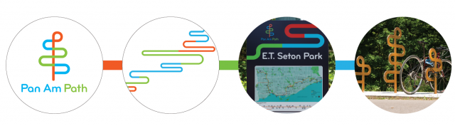
Behind The Design The design of the Pan Am Path branding drew inspiration from elements of the city of Toronto. The typography, colours, and organic forms were re-interpreted into the path’s elegant, yet playful, identity.
Most important to the design, the letter 'P' was vertically repeated (for 'Pan Am' and 'Path') to form a symbol representing the theme of connections between the various existing trails and the diverse neighbourhoods along the Path. The design reinforces this multi-level collaboration between residential and commercial, art and nature, urban and suburban.
The letter ‘P’ was stretched to form a decorative pattern representing the Path, which became a design element used on both signage and printed materials. The visual mark was also adapted for sculpture bike racks, and marks the bike lanes, refreshing the user experience of the trails.
All of the iterations of the identity’s design are thoughtful creations, developed to take into consideration the functionalities of the trail. The design is easy to identify and enjoy.
“As a Toronto-based design firm, we welcome opportunities to give back to the city we love with our creativity. The Pan Am Path project is a perfect opportunity to do that, especially as it reaches out to both residents and visitors of our beautiful city”, says Edmund Li, Lead Designer and Associate at Reich+Petch. “It was also a truly collaborative process working with the City's project team. It’s so rewarding when the client is as passionate about the project as we are, and the final product shows.”
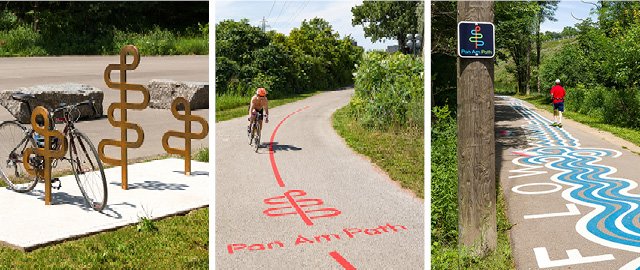
Implementation of branding and identity, Photo Credit: Kerun Ip Photography
Team
Branding designed by Reich+Petch; Final signage layout designed by the City of Toronto design staff; Painted Trail Installatiom: Roadsworth in collaboration with Native Earth; Commissioned by the Pan Am Path Art Relay.
About Reich+Petch Reich+Petch is a multi-disciplinary design collaborative with over 25 years’ experience. The firm includes architects, interior, graphic, industrial and environmental designers. They have worked in over 20 countries, have appeared in numerous publications and have won many awards. The hallmark of their work and brand is “experience design” and they are firmly rooted in the importance of the visitor experience. They are inspired by opportunities that allow them to create meaningful and engaging environments that excite the senses and make an emotional connection. Reich+Petch have created signature projects that have come to define the very clients they work for.
Want to visit the Pan Am Path?
Click here for a map courtesy of City of Toronto.