“Not only has the building never looked better; many hope it will be a harbinger of the good things to come to a part of town where that has been rare.”
Christopher Hume, Architecture Critic for the Toronto Star, March 29, 2013
Well-designed libraries are community builders. Beyond book storage and computer access, many libraries are community hubs for numerous programs and services. When seeking to revitalize a neighbourhood, a well-designed library has the potential to catalyze change well beyond its walls. Located in one of Toronto’s
31 Neighbourhood Improvement Areas , the recently renovated Mount Dennis Branch Library illustrates the impact good design can have in improving the wellbeing of a community.
Originally opened in 1951, the Mount Dennis Branch Library has undergone numerous renovations throughout its 65 year history. The original brick structure was designed by Albert Edward Vine, the architect behind many libraries in the former City of York. Decades after, in the early 1980s, Moffet & Duncan Architects led an extensive renovation of the library, including an addition to the main floor. With the passing of the years, and a number of spatial and programmatic changes, the library struggled to meet the needs of the community. Looking to more closely meet these demands and increase the impact of the library within the neighbourhood, in 2011 the Mount Dennis Branch Library went through its most recent renovation designed by
G. Bruce Stratton Architects. Since its reopening in 2013, this award winning renovation has become a shining example of how good design and smart programming can transform an underused library into a beacon for community programs and services.
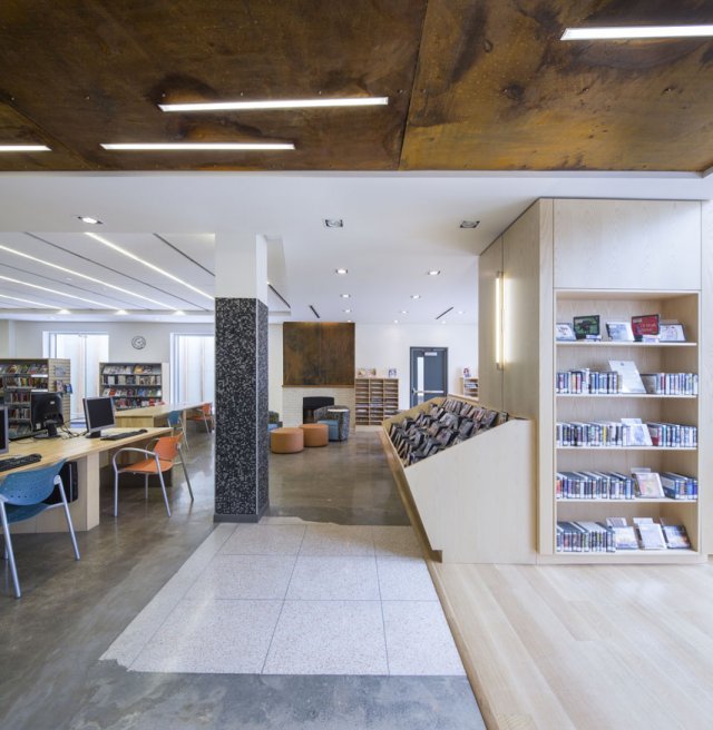
Photo Credit: Stephane Groleau
From the Architects: It has been previously described as a building block. The redesign of Mount Dennis Library was approached as both urban design and intimate architecture. The building needed improved use of space and to become an integral piece of the streetscape. We decided to start with the ideas of light and eccentricity.
The existing library was a ‘maze’ of corridors on both levels. The existing skylights leaked, the entrance was hidden behind an aging trellis and a courtyard was used for recycle bins. This was all packaged with an aesthetic more in line with the neighbouring church rectory than a public library. The library was domestic and had little in common with the strip of commercial buildings it anchored.
The solution was to rid the floor plan of the corridors and make the entrance very direct from the street edge. Light would be added by making windows larger, providing a two storey translucent facade, adding long clerestory windows, and cutting in a central open stair to the floor plan. The library would not only be brighter on the inside but would provide a warm glow in the evening to a strip of dimly lit buildings. It would allow the passerby to see inside as well as those inside to ‘have eyes’ looking out. From the lower level you could now look up through the open central staircase to the floor above. You would even see the light provided by the rooftop clerestory. The floor plan was now more eccentric. From the centre stair you could see the library book stacks, out into the courtyard or to the lower level, or onto the sidewalk out front and Weston Road beyond. You could also look beyond to the church next door and the laneway people used to access the parking lot in behind. Overall, the building was more ‘exposed’ both on the interior and exterior. The design would also transform the courtyard space into a reading garden with a cedar trellis and bench seating.
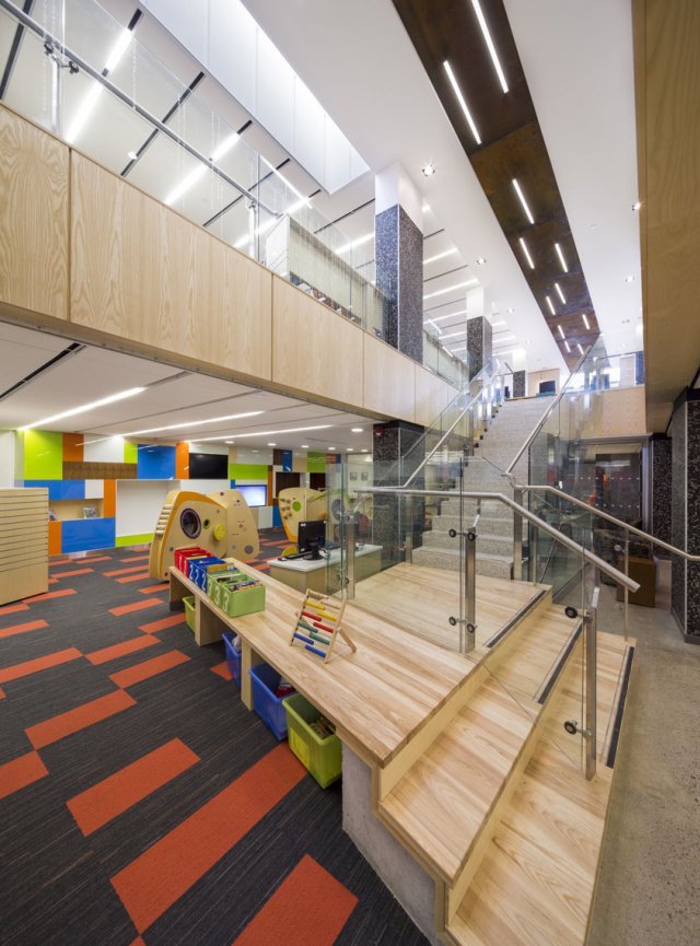
Photo Credit: Stephane Groleau
Upon design and subsequent construction, many of the buildings original elements were uncovered and incorporated into the design creating a collage of some old and new. The fireplace was refurbished, original brick walls cleaned and exposed, and patches of the existing terrazzo and concrete flooring were also utilized.
The exterior was more of a challenge. The concept of addition was embraced for budgetary reasons. Although the entire building was renovated on the interior, the front was reinforced to look like an addition to the remainder of the 1980s building. The proposed palette of materials included terracotta, brick, weathered steel, and channel glass of which some could be found in the neighbouring buildings. Red tones of the rugged clays and weathered steel with the precast concrete bench would ideally accentuate the fragility of the glass and the openings being framed. The datum of the existing neighbouring buildings was also considered.
It is interesting how libraries have evolved from darker secluded buildings of few windows to protect the books to larger, inviting, open spaces bathed in light. Their ability to function as a community gathering space has definitely influenced this shift along with the ease of use of technology. The design approach of Mount Dennis is a reflection of the latter.
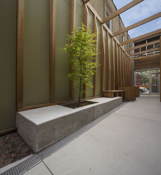
Photo Credit: Stephane Groleau
Since its re-opening in 2013, the library has received numerous awards including the 2013 Toronto Urban Design Award – Award of Excellence for Public Buildings in Context, the 2014 OAA Design Excellence Award and 2014 Michael V. and Wanda Plachta Award, and the 2015 OLA Library Building Award.